


Hello everyone, 👋🏻
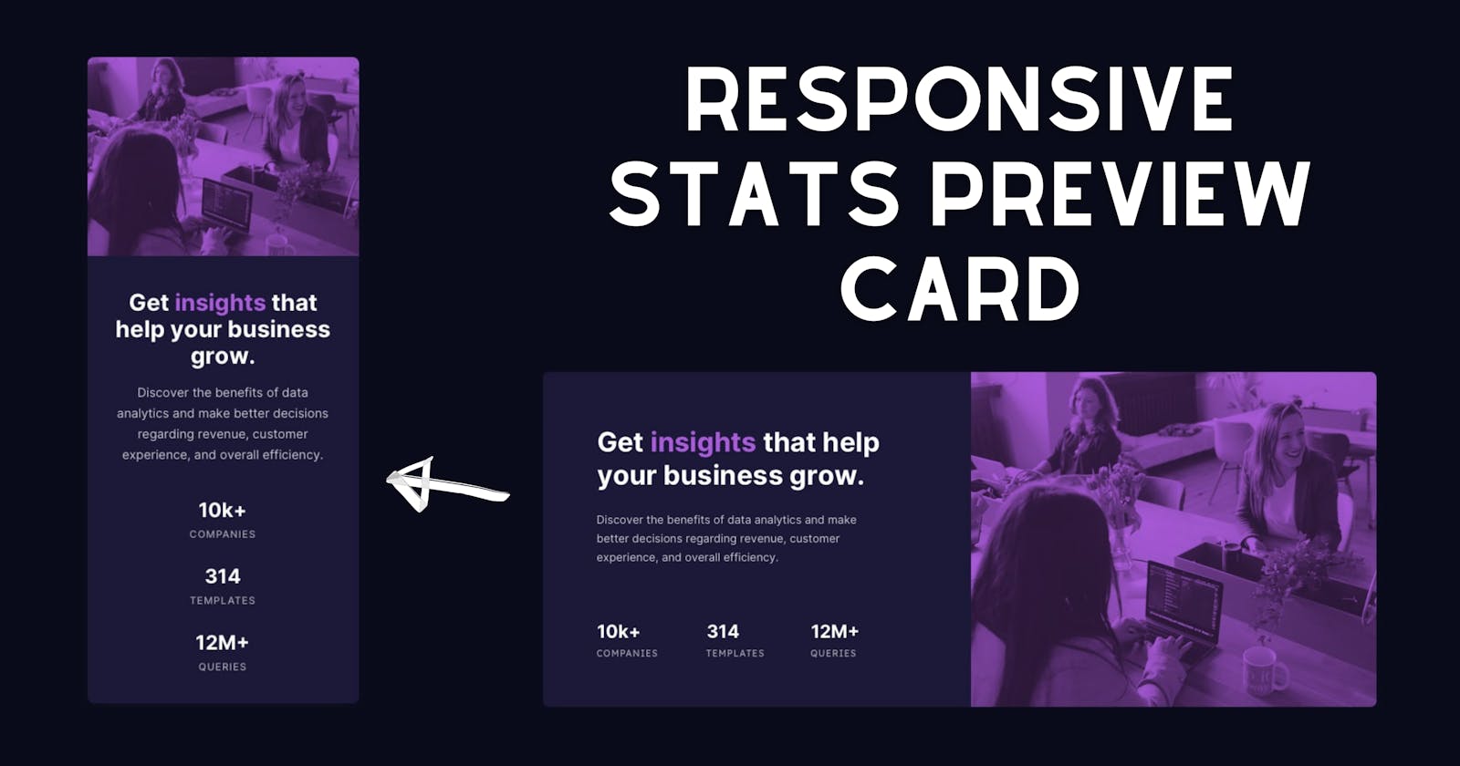
In this article, I'm going to design a Responsive Stats Preview Card by using HTML & CSS and as mentioned in the article's title it is a responsive design(for desktop and mobile screen size). This design is a challenge from FrontendMentor.io, you can also visit FrontendMentor.io and complete this challenge there.
If you are confused by this application or enjoy watching tutorials. I've included a comprehensive video instruction for this program below. I'm confident that after seeing this video, all of your questions will be answered.
Video of Responsive Stats Preview Card
For image files, you can find the Github Repository link in the YouTube video description.
Source Codes
To copy the program's provided codes, you should first create two files, one of which is an HTML file and the other of which is a CSS file. You can copy-paste the provided codes into your files after you've created these two files.
HTML Code:
<!DOCTYPE html>
<html lang="en">
  <head>
    <meta charset="UTF-8" />
    <meta name="viewport" content="width=device-width, initial-scale=1.0" />
    <link rel="stylesheet" href="styles.css" />
    <base target="_blank" />
    <title>Stats Preview Card Component</title>
  </head>
  <body>
    <main>
      <section>
        <h1>Get <span>insights</span> that help your business grow.</h1>
        <div class="content">
          <p class="lead">
            Discover the benefits of data analytics and make better decisions
            regarding revenue, customer experience, and overall efficiency.
          </p>
          <ul>
            <li>
              <h2>10k+</h2>
              <p>companies</p>
            </li>
            <li>
              <h2>314</h2>
              <p>templates</p>
            </li>
            <li>
              <h2>12M+</h2>
              <p>queries</p>
            </li>
          </ul>
        </div>
      </section>
      <div class="bg-img">
        <div class="overlay"><div class="overlay-2"></div></div>
      </div>
    </main>
    <footer class="attribution">
      <p>
        Coded by
        <a href="https://github.com/abhayxkumar">Coding Room</a>.
      </p>
    </footer>
  </body>
</html>
CSS Code:
@import url("https://fonts.googleapis.com/css2?family=Inter:wght@400;700&family=Lexend+Deca&display=swap");

/* variables */

:root {
    font-size: 15px;
    --prim-dark-blue: hsl(233, 47%, 7%);
    --prim-sat-blue: hsl(244, 38%, 16%);
    --prim-violet: hsl(277, 64%, 61%);

    --neu-white: hsl(0, 0%, 100%);
    --neu-trans-white: hsla(0, 0%, 100%, 0.75);
    --neu-more-trans-white: hsla(0, 0%, 100%, 0.6);

    --bg-violet: hsl(277deg, 100%, 50%, 0.42);
    --bg-light-violet: hsl(293deg, 42%, 35%, 0.24);
}

/* defaults */

*,
*::after,
*::before {
    margin: 0;
    padding: 0;
    box-sizing: border-box;
}

body {
    font-family: "Inter", sans-serif;
    display: flex;
    justify-content: center;
    align-items: center;
    min-height: 100vh;
    background-color: var(--prim-dark-blue);
    color: var(--neu-white);
    font-weight: 400;
}

/* stats card */

main {
    min-width: 600px;
    z-index: 1;
    display: flex;
    margin: 1em;
}

section {
    display: flex;
    flex-direction: column;
    padding: 5.85em 7em 5.85em 5.85em;
    width: 570px;
    min-width: 300px;
    background: var(--prim-sat-blue);
    border-radius: 10px 0 0 10px;
}

section h1 {
    color: var(--neu-white);
    font-size: 2.25rem;
    margin-bottom: 0.75em;
    font-weight: 700;
}

section h1 span {
    color: var(--prim-violet);
}

section .content {
    margin-right: 2em;
}

section .lead {
    color: var(--neu-trans-white);
    line-height: 1.5em;
    margin-bottom: 5em;
}

section ul {
    display: flex;
    list-style: none;
    justify-content: space-between;
    letter-spacing: 1px;
}

section ul h2 {
    color: var(--neu-white);
    margin-bottom: 0.3em;
}

section ul p {
    font-family: "Lexend Deca", sans-serif;
    color: var(--neu-more-trans-white);
    text-transform: uppercase;
    font-size: 0.75rem;
}

.bg-img {
    min-height: 10em;
    width: 540px;
    min-width: 200px;
    background: url(images/image-header-desktop.jpg);
    background-repeat: no-repeat;
    background-size: cover;
    border-radius: 0 10px 10px 0;
    overflow: hidden;
}

.overlay {
    background: var(--bg-violet);
    height: 100%;
}

.overlay-2 {
    background: var(--bg-light-violet);
    height: 100%;
    mix-blend-mode: color-burn;
}

/* footer */

.attribution {
    position: absolute;
    bottom: 0;
    font-size: 0.75rem;
    line-height: 20px;
    text-align: center;
    color: var(--neu-more-trans-white);
    margin-bottom: 10px;
}

.attribution a {
    text-decoration: none;
    color: var(--neu-trans-white);
    font-weight: bold;
}

.attribution a:hover {
    color: var(--prim-violet);
}

/* media queries */

@media only screen and (max-width: 1024px) {
    :root {
        font-size: 12px;
    }

    section {
        padding: 3em 4.5em 3em 3em;
    }
}

@media only screen and (max-width: 625px) {
    body {
        flex-direction: column;
    }

    main {
        flex-direction: column-reverse;
        margin: 10px;
        min-width: 200px;
        margin-top: 5em;
    }

    section {
        padding: 0;
        padding: 3em;
        width: 300px;
        border-radius: 0 0 10px 10px;
    }

    section h1,
    section .lead {
        text-align: center;
    }

    section .lead {
        font-size: 1.1rem;
        margin-bottom: 2em;
        line-height: 1.75em;
    }

    section .content {
        margin-right: 0;
    }

    section ul {
        flex-direction: column;
        align-items: center;
    }

    section ul li {
        margin-bottom: 2em;
    }

    section ul h2 {
        font-size: 2rem;
        text-align: center;
        margin-bottom: 0.25em;
    }

    section ul p {
        font-size: 1.05rem;
    }

    .bg-img {
        height: 220px;
        width: 300px;
        border-radius: 10px 10px 0 0;
        background: url(images/image-header-mobile.jpg) no-repeat;
        background-size: contain;
    }

    .attribution {
        position: relative;
        margin-top: 20px;
    }
}