


Hello everyone, 👋🏻
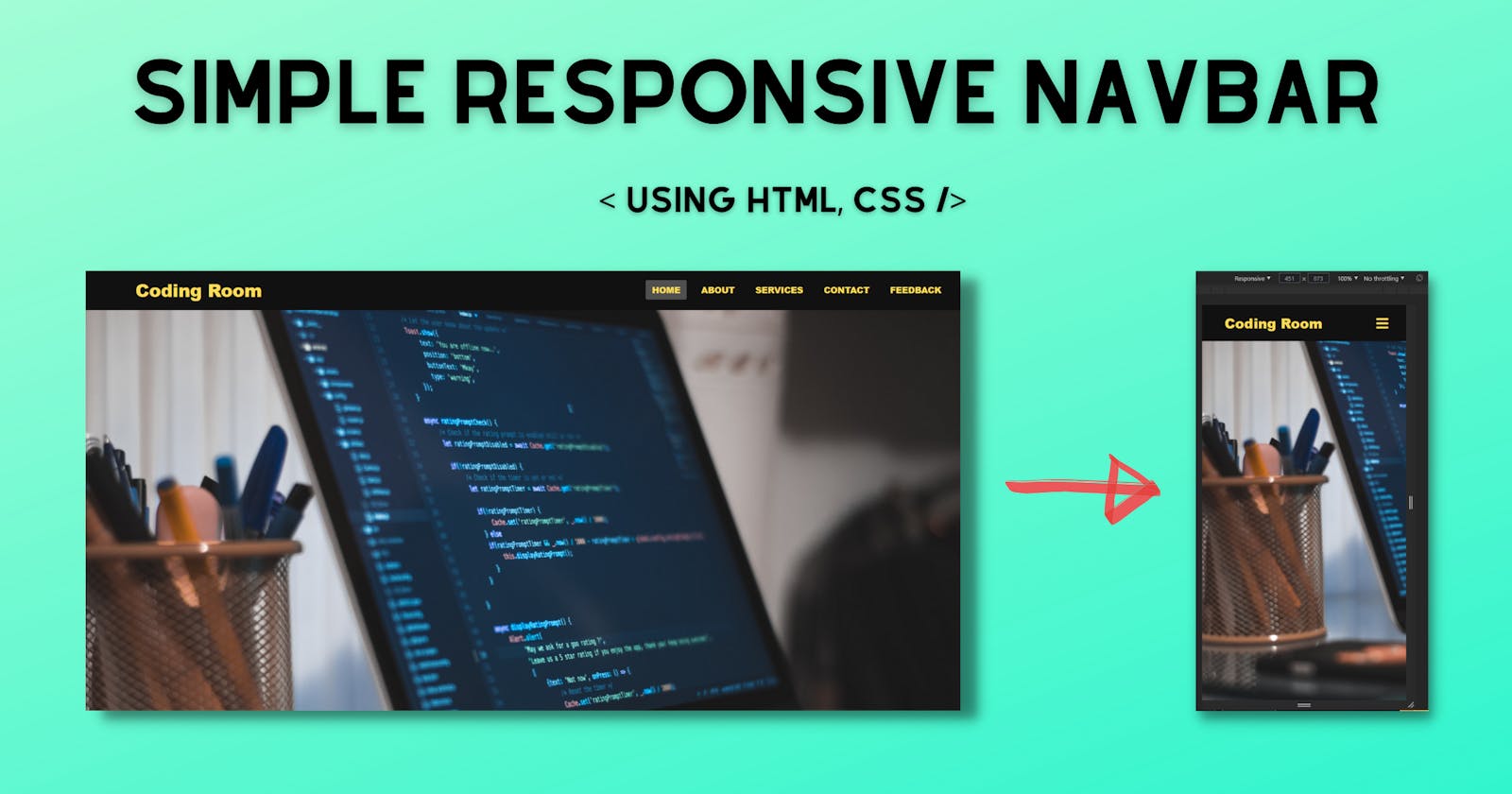
In this article, I'm going to design a Simple Responsive Navbar by using HTML & CSS and as mentioned in the article's title & subtitle, it is a responsive design(for desktop and mobile screen size).
If you are confused by this application or enjoy watching tutorials. I've included a comprehensive video instruction for this program below. I'm confident that after seeing this video, all of your questions will be answered.
Video of Simple Responsive Navbar
For image files, you can find the Github Repository link in the YouTube video description.
Source Code
To copy the program's provided codes, you should first create two files, one of which is an HTML file and the other of which is a CSS file. You can copy-paste the provided codes into your files after you've created these two files.
HTML Code
<!DOCTYPE html>
<html lang="en" dir="ltr">
  <head>
    <meta charset="utf-8" />
    <title>Simple Responsive Navbar</title>
    <meta name="viewport" content="width=device-width, initial-scale=1.0" />
    <link rel="stylesheet" href="style.css" />
    <script src="https://kit.fontawesome.com/a076d05399.js"></script>
  </head>
  <body>
    <nav>
      <input type="checkbox" id="check" />
      <label for="check" class="checkbtn">
        <i class="fas fa-bars"></i>
      </label>
      <label class="logo">Coding Room</label>
      <ul>
        <li><a class="active" href="#">Home</a></li>
        <li><a href="#">About</a></li>
        <li><a href="#">Services</a></li>
        <li><a href="#">Contact</a></li>
        <li><a href="#">Feedback</a></li>
      </ul>
    </nav>
    <section></section>
  </body>
</html>

<!-- Made by Coding Room -->
CSS Code
* {
    padding: 0;
    margin: 0;
    text-decoration: none;
    list-style: none;
    box-sizing: border-box;
}

body {
    font-family: Segeo, sans-serif;
    font-weight: 1000;
}

nav {
    background: #111111;
    height: 80px;
    width: 100%;
}

label.logo {
    color: #ffde59;
    font-size: 35px;
    line-height: 80px;
    padding: 0 100px;
    font-weight: 1500;
}

nav ul {
    float: right;
    margin-right: 20px;
}

nav ul li {
    display: inline-block;
    line-height: 80px;
    margin: 0 5px;
}

nav ul li a {
    color: #ffde59;
    font-size: 17px;
    padding: 7px 13px;
    border-radius: 3px;
    text-transform: uppercase;
}

a.active,
a:hover {
    background: #505050;
    transition: .5s;
}

.checkbtn {
    font-size: 30px;
    color: #ffde59;
    float: right;
    line-height: 80px;
    margin-right: 40px;
    cursor: pointer;
    display: none;
}

#check {
    display: none;
}

@media (max-width: 952px) {
    label.logo {
        font-size: 30px;
        padding-left: 50px;
    }

    nav ul li a {
        font-size: 16px;
    }
}

@media (max-width: 858px) {
    .checkbtn {
        display: block;
    }

    ul {
        position: fixed;
        width: 100%;
        height: 100vh;
        background: black;
        top: 80px;
        left: -100%;
        text-align: center;
        transition: all .5s;
    }

    nav ul li {
        display: block;
        margin: 50px 0;
        line-height: 30px;
    }

    nav ul li a {
        font-size: 20px;
    }

    a:hover,
    a.active {
        background: none;
        color: #ffde59;
    }

    #check:checked~ul {
        left: 0;
    }
}

section {
    background: url(bg.jpg) no-repeat;
    background-size: cover;
    height: calc(100vh - 80px);
}

/* Made by Coding Room */